I'm interested in the space between business, technology and people — and in making complex things feel simple.
I enjoy taking complex ideas and turning them into clear, useful experiences: from early product thinking and UX flows to polished interfaces and design systems that engineers like using. I work closely with founders, PMs and developers, and I care as much about why something exists as how it looks.
What I do
Product DesignFuzzy brief to shipped feature
UX/UI DesignFlows, screens, the small details
Design SystemsTokens, components, documentation
Interaction DesignMotion and states that explain
PrototypingTest the idea before building it
Product StrategyWhat to build, and in what order
Design-to-DevelopmentSpecs and handoff devs trust
Web & Mobile DesignResponsive, iOS and Android
✦ Fun
When I'm not designing…
Most of my good ideas show up away from the screen. These are the usual suspects.
CoffeeMusicTravelTechnologyPhotographyFootballLearning new things
Brewing
Pour-over, slowly getting better at it
On repeat
Afrobeats on weekdays, lo-fi when it's crunch time
Watching
Super Eagles qualifiers, with too many opinions
Learning
Front-end motion, one tiny experiment a week
✦ Contact
Have a product worth building?
Have an idea, product or problem you'd like to explore? I'd love to hear about it. I usually reply within two working days.
A deep-dive into the visual language, colour architecture and component system powering a workforce management platform built for healthcare professionals across Australia and New Zealand.
✦Overview
Role
Product Designer
Platform
Web & iOS
Timeline
2 months · 2024
Team size
10 people
Skills
Design system documentation Colour architecture, tokens, components, Figma-to-code pipeline
Overview
The design challenge was significant: a healthcare worker's relationship with shift work is stressful, time-sensitive and often compliance-driven. The platform needed to feel trustworthy and efficient without feeling clinical or bureaucratic. A unified design system, especially a clear, purposeful colour language, was the foundation of that goal.
What shipped is a token-based system live in Figma and code. Claude gave the build speed, but every architectural call stayed mine.
✦Highlights
40+
Components
Built highest-use first, fully tokenised, with every interactive state.
2
Token layers
Primitive and semantic tokens, live in Figma and mirrored in code.
AA
WCAG 2.2 by default
Colour pairings that fail never reach the semantic layer.
1
Source of truth
A Figma-to-code pipeline documented in Storybook for the team.
✦The Challenge
Background
Pulse is the mobile workforce platform built by Acacium Group, one of the largest healthcare staffing agencies in the UK and ANZ. The app serves agency workers: nurses, educators, carers and allied health professionals who need to manage variable shifts, availability windows, compliance paperwork and timesheets, all from a single interface.
The platform needed to feel trustworthy and efficient without feeling clinical or bureaucratic.
Understanding the problem
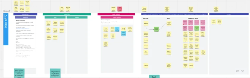
I began by hosting a kickoff session to understand the background behind the service. The session brought together UX, PMs, marketing and delivery to make sure everyone was on the same page. The key questions I wanted answered were:
What is the problem?
Why does the problem exist?
Who would be the target audience?
Where is this service focused?
When does the website need to be released?
The kickoff board: background, competitors, target audience, candidate journey and a parking lot for open questions.
✦The Solution
Setting up the core foundation
Two things had to be true for this system to succeed:
01
Decide once, not fifty times
Foundations that make a decision once, so every screen inherits it instead of re-solving it.
02
Live beyond Figma
A system that exists in code as well as in Figma, so design and build never drift apart.
✦Visual Design
A purposeful colour language
Colour carried the most weight. Deep navy and teal give the app a calm, trustworthy base, the sky blue keeps it warm and approachable, and a small set of status colours tells a worker at a glance where every shift and timesheet stands.
Deep navy#0B4864Headers, primary text
Ocean#326C82Header gradients
Teal#138496Primary actions
Sky#A8DEF8Brand surface
OngoingScheduledSubmittedOutstandingApproved
Values sampled from the shipped Pulse screens.
Spacing adopted an 8px scale
An 8px scale with 4px micro-adjustments applied to padding, gaps and margins. Corner radius follows the same logic. Spacing stopped being a per-component guess.
4
8
16
24
32
48
64
And finally, the components
40+ components, built highest-use first: navigation, dropdowns, cards. Every one is on auto-layout, fully tokenised, and covers its interactive states, including hover.
✦Key Features
01
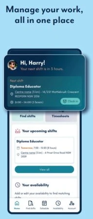
Manage your work, all in one place
The home screen greets the worker by name, counts down to the next shift, and puts the shift details and a one-tap Clock in right at the top, with shortcuts to find shifts and timesheets.
02
Set your availability
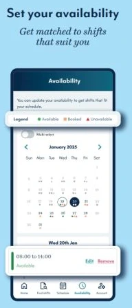
A monthly calendar with a clear Available, Booked and Unavailable legend. Workers add time windows, edit or remove them, and select several days at once so they get matched to shifts that suit them.
03
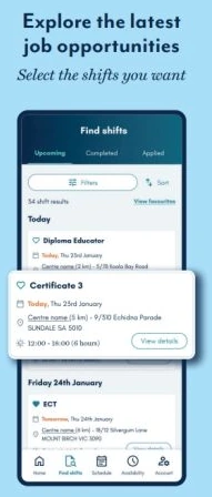
Explore the latest job opportunities
Upcoming, Completed and Applied tabs, filters and sorting, and shift cards that show role, date, centre, distance and hours at a glance, so workers can pick the shifts they want.
04
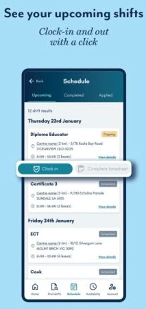
See your upcoming shifts
A schedule grouped by day, with status tags for each shift and clock-in and clock-out with a click, followed straight away by completing the timesheet.
05
Submit and track your timesheets
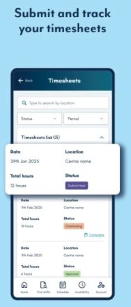
Search by location, filter by status and period, and see every timesheet's date, location, total hours and status, from Outstanding to Submitted to Approved.
✦Technical Pipeline
Getting tokens out of Figma
Once the visual foundations were set, the system had to become deployable code. Before this, updating a token meant copying values from Figma into code by hand, with no way to know if a file had drifted until something looked wrong.
FigmaVariables and components
TokensPrimitive and semantic layers
CodeMirrored in the repo
StorybookDocumented for the team
✦AI Workflow
Working with Claude as a creative partner, and catching it where it drifts
Claude is only as useful as the context you give it. Before asking for anything, I fed it six files, covering:
Project instructionsPersonasDesign principlesPlatform constraintsDesign system best practices
With the Figma MCP connected, I built the foundations in order: colour, typography, spacing, radius, elevation, layout. Every semantic token got a written description covering when to use it and why.
Claude Code ran in parallel on the repo, reading across the codebase, editing files, and keeping Figma and code aligned as the system grew.
Benchmarking did the job context alone couldn't
I kept three systems open through the entire build:
Nord Health
Healthcare-specific reasoning
Atlassian
Scale and token architecture
Polaris
Its staged component model
That running comparison is what told me when to push back on Claude's output instead of taking it as given.
✦Outcome
Where the system stands today
Primitive and semantic tokens are live in Figma and mirrored in code. The foundation the product needed from the start now exists, and every new screen starts from a decision instead of a guess.
Accessibility is encoded at the token level
Accessibility used to be a checklist at the end. Now it's built into the token layer itself. If a colour pairing fails WCAG 2.2 AA, it isn't in the semantic layer to begin with, so there's nothing failing to catch later.
Documentation that explains
The documentation is built in Storybook and explains what each token is for and when not to use it, so extending the system doesn't mean re-arguing decisions that are already made.
The next test is putting it in front of someone else: a designer extending the system or a developer implementing it.
✦Reflections
AI gives speed, but judgment is mine
Output still needs checking
Claude built the structure fast. Whether it was any good took checking it against systems that already worked.
Learning while building
I learned design systems by working through naming conventions and token structure, asking Claude when I was unsure.
TegaPay · Mobile Banking
TegaPay
Summer 2026 Leading design for a better banking experience
0 → 1FintechiOS native
Prototype walkthrough
See TegaPay in motion
A tour of the clickable prototype built for investors and first users: onboarding, the home dashboard, virtual cards, transfers and analytics.
Designed to simplify everyday banking by bringing payments, transfers, card management and financial insights into one seamless digital experience.
✦Overview
Role
Freelance Lead Designer
Platform
iOS native
Timeline
2 months · Summer 2026
Team
2 co-founders, a PM, an engineer and me
Type
0 → 1 MVP · Fintech
Deliverables
Design User flows, high-fidelity screens, clickable prototype
Overview
TegaPay is a mobile banking redesign for iOS: a ground-up rethink of how people interact with their money.
I was brought in in Summer 2026 to lead the design of their MVP. When TegaPay approached me, they had an idea of what they wanted to build, but nothing solidified, and a tight deadline of two months to have the designs completed.
The goal was to get a working prototype to show investors, raise funding and test with initial users.
✦Highlights
60s
To get things done
Check a balance, send money and understand spending within a minute of opening the app.
17
Core screens
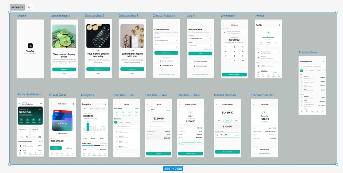
From splash and onboarding to transfers, deposits, withdrawals and analytics.
2
Months to MVP
From a loose idea to investor-ready designs and a working prototype.
0→1
Built from scratch
A new product with no existing design to lean on.
✦The Challenge
The vision: banking, made simpler
Most mobile banking apps were designed by committees who optimised for feature parity rather than user clarity. The result is interfaces that leave users anxious instead of informed.
Pinpointing the issues
Crammed widgets competing for attention on every screen
Buried navigation that hides everyday tasks
No meaningful hierarchy, so nothing feels important
Anxious users who feel unsure instead of informed
A person should be able to check their balance, send money to a contact and understand their spending, all within 60 seconds of opening the app.
✦Research
Understanding the people behind the brief
With two months and an idea that wasn't solidified yet, research had to be quick and focused. I started from the founders' vision and the 60-second brief, looked closely at how everyday banking apps handle the same jobs, and turned what we learned into a clear picture of who TegaPay was for.
Who we designed for
EU
The everyday money manager
A busy professional who banks on their phone, several times a day
Goals
See their balance at a glance
Pay people fast
Know where the money went
Frustrations
Cluttered home screens
Transfers hidden in menus
Fees discovered too late
Needs
A clear hierarchy
Quick actions up front
Confidence before sending
Where existing banking apps fall short
Pain point A
Interfaces crammed with widgets
Feature parity wins over clarity, so the balance and the next action compete with everything else on screen.
Pain point B
Buried navigation
Everyday tasks like sending money or finding a card sit several taps deep, behind menus that change from screen to screen.
Pain point C
Anxiety instead of information
Without hierarchy or clear confirmations, people aren't sure what they're paying, what it costs, or where their money went.
User journey map
I mapped the end-to-end journey of a new TegaPay user to find where friction builds up, and where the app could stand out.
Scroll sideways to see the full map →
Stages
Onboarding
Checking balance
Sending money
Managing cards
Tracking spending
Actions
Download, read the intro, create an account or log in
Open the app, find the balance and recent changes
Pick a recipient, enter an amount, review and confirm
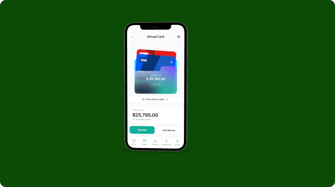
View virtual cards, check card balance, add money
Review analytics, search and filter transactions
Goals
Get set up quickly and feel safe
Know exactly where they stand
Pay the right person without mistakes
See every card in one place
Understand their spending pattern
Touchpoints
Splash, onboarding, create account, log in
Home dashboard, balance card
Transfer: select recipient, amount, review
Virtual card, cards tab
Analytics, transactions, transaction details
Emotions
🙂Curious
😐Unsure
😣Anxious
🤨Confused
😞Overwhelmed
Pain points
Long sign-ups ask for too much, too soon
The balance competes with promotions and widgets
Fees and totals only appear at the very end
Cards are split across different screens
Raw lists with no summary of where money went
Opportunities
Three calm intro screens, with Get Started and Log in always visible
Lead the home screen with the balance and four quick actions
A review step that shows the fee and the total before sending
Stack every card in one view with a single total balance
Weekly, monthly and yearly charts with income, expenses and net saved
✦Ideation
With a clear picture of the friction, I turned each opportunity into a question the design had to answer, then mapped how people would move through the app before designing a single screen.
01
How might we…
HMW
…make a balance readable in a single glance?
HMW
…let someone send money to a contact in under 60 seconds?
HMW
…show every fee before a person commits to a transfer?
HMW
…turn a list of transactions into an understanding of spending?
02
User flows
I mapped the core flows end to end to define the MVP's scope and make sure each job could be finished in as few steps as possible.
Get started
Splash→Onboarding ×3→New or returning?→Create account / Log in→Home
Five tabs, each owning one job, so nothing important is ever more than a tap away.
Home
Balance
Transfer
Deposit
Withdraw
Scheduled payments
Cards
Virtual cards
Total balance
Add money
Analytics
Spending chart
Income & expenses
Where it went
Transactions
Search
Filters
Details & receipt
Profile
Personal info
Preferences
Security
✦The Solution
Design around the three 60-second jobs
Every screen was judged against the brief. If it didn't help someone check, send or understand their money faster, it didn't make the MVP.
01
Check your balance
The balance leads the home screen, with change over the last 24 hours right underneath.
02
Send money
Transfer, Deposit, Withdraw and More sit one tap away, and every transfer ends on a clear review.
03
Understand spending
Income, expenses and a weekly spending chart turn transactions into something readable.
✦Design & Delivery
From a loose idea to an investor-ready MVP
I worked closely with the two co-founders, a PM and an engineer. With two months on the clock, the process was built for fast decisions.
AlignTurn the founders' idea into a clear brief
DefineSet the 60-second jobs to design for
MapFlows for onboarding, transfers and deposits
DesignHigh-fidelity iOS screens
PrototypeA clickable build for investors and users
Every screen in the MVP, from splash to transaction details.
✦Key Features
01
Onboarding that sets the tone
Three calm screens introduce the promise: take control of every dollar, your money smarter every day, and banking that moves with you. Get Started and Log in are always within reach.
02
A home dashboard and a transfer in three steps
The home screen leads with the available balance and four quick actions. A transfer moves from choosing a recipient, with recent contacts and search, to an amount and a review that spells out the fee and the total before anything is sent.
03
Analytics and transactions you can read
Weekly, monthly, quarterly and yearly views show spending against last week, income, expenses and net saved. Transactions are searchable by merchant, amount or date and filterable by card, transfers or income.
✦Visual Design
Calm colour, clear signals
A near-black ink and a soft off-white canvas keep the interface quiet, so the TegaPay teal can mark the actions that matter. A deep green gradient gives the balance card weight, and small tinted pills signal income and expenses at a glance.
Colours and components taken from the TegaPay screens.
✦Outcome
An MVP ready for investors and first users
Within the two-month deadline, TegaPay went from an idea with nothing solidified to a complete set of high-fidelity iOS screens and a clickable prototype, ready to show investors and to test with initial users.
Complete core journeys
Onboarding, account creation and log in, the home dashboard, cards, transfers, deposits, withdrawals, analytics and transaction history.
A working prototype
A clickable build that lets investors and first users experience the product, not just look at it.
✦Reflections
A clear brief makes a short deadline possible
The 60-second rule did the prioritising
Measuring every idea against the three core jobs made it easy to say no to features that didn't belong in an MVP.
Working close to the founders
Designing alongside the co-founders, PM and engineer kept decisions fast and turned an unformed idea into a product the team could stand behind.
Thanks for reading!
Vestra · Crypto portfolio tracker
Vestra
2024 Making crypto make sense through a calmer, clearer experience
Web & iOSLanding PageGrowth Design
As product designer on Vestra, I redesigned a crypto trading and wallet platform so investors could see every coin, across every chain, in one clear picture.
✦Overview
Role
Product Designer
Platforms
iOS, Web, Webflow
Year
2024
Team size
10–20
Scope
Product, brand and marketing Web dashboard and mobile app redesign, a component-driven design system, the marketing website in dark and light themes, and trust-first flows for portfolio tracking, swaps, staking and tax reporting.
Overview
Vestra is a portfolio tracker for people whose crypto lives in too many places.
It connects to 500+ exchanges and wallets with read-only access, prices every holding in real time, and turns a year of transactions into a tax report you can actually file.
The landing page has one job: convince a careful crypto holder to connect their first wallet.
✦Highlights
10
Sections, one question each
The page is ordered by what a careful investor asks before connecting a wallet.
2·3·1
Above the fold
Two calls to action, three trust signals and one real product shot.
500+
Exchanges and wallets
Connected with read-only access and priced in real time.
2
Themes
The marketing site designed in both dark and light.
✦The Challenge
A landing page that could have belonged to anyone
The first wireframe followed a generic fintech template, with a virtual card and a recurring-spend tracker borrowed from another kind of product. It looked like a landing page, but it didn't tell people what Vestra actually does.
The hero paired a broad promise, "A smarter way to buy, track and grow crypto", with a placeholder for lifestyle photography. It could have belonged to any crypto app.
Convince a careful crypto holder to connect their first wallet.
✦Research
Understanding the careful crypto holder
The landing page had one job: convince a careful crypto holder to connect their first wallet. To do that, I needed to understand what makes this person hesitate, and what they need to see before they trust a product with read access to their money.
Who the page is for
CH
The careful crypto holder
Holds assets across several exchanges and wallets, and is wary of anything that touches them
Goals
See every coin in one place
Trust the numbers
File taxes without a spreadsheet
Frustrations
Crypto spread across many apps
Totals that never agree
A year of transactions to reconcile
Fears
Losing funds
Giving an app too much access
Marketing that overpromises
What stood in the way
Pain point A
A page that could belong to anyone
The first wireframe borrowed a virtual card and a spend tracker from another kind of product, and never said what Vestra actually does.
Pain point B
Promises without proof
A broad headline and a lifestyle photo gave a careful visitor nothing to check, so there was no reason to believe the claims.
Pain point C
The fear of losing funds
In crypto, the biggest objection is access. A page that doesn't answer it directly loses the visitor at the moment of connecting.
Visitor journey map
I mapped the journey from first landing on the page to connecting a first wallet, to see where doubt creeps in and what each section needed to resolve.
Scroll sideways to see the full map →
Stages
Land
Understand
Verify
Trust
Connect
Question
What does it track?
What do I get?
Are the numbers right?
Can it touch my money?
How does it work?
Actions
Read the headline, scan the product shot
Explore features and the mobile app
Check live prices and the stats strip
Read the security section and the FAQ
Follow the three steps, start for free
Touchpoints
Hero, trust signals
Feature cards, app section
Live markets, stats strip
Security, FAQ
How it works, pricing, call to action
Emotions
🤨Sceptical
🙂Interested
😐Checking
😣Cautious
😊Reassured
Pain points
Generic promises look like every other crypto app
Feature lists without showing the product
Prices and totals that don't match elsewhere
No clear answer on access to funds
Unclear what happens after signing up
Opportunities
Name the job in one line and show a real dashboard
Put a real screen beside the copy
Live prices and proof of scale, in numbers that agree
"We can read. We can never move." with read-only keys
Three simple steps and plain pricing
✦Ideation
With the visitor's questions mapped, I turned each one into a design problem and then ordered the page so every section answers one of them.
01
How might we…
HMW
…explain what Vestra does in a single line?
HMW
…prove the numbers are right instead of just saying so?
HMW
…answer the fear of losing funds before it stops someone?
HMW
…make connecting a first wallet feel like a small, safe step?
02
Page flow
I mapped the path a visitor takes down the page, with a clear way to act at every point where they might be ready.
Ready now
Hero→Get started for free→Connect first wallet
Still deciding
Hero→See how it works→Live prices→Security→Pricing & FAQ→Connect first wallet
Not yet
Footer→Market notes, once a week→Come back later
03
Mapping questions to sections
Each question became a section, in the order a careful investor asks them.
What does it track?
Hero
Portfolio dashboard
Are the numbers right?
Live markets
Stats strip
What do I get?
Features
Mobile app
How does it work?
Three steps
Pricing
Can it touch my money?
Security
FAQ
✦The Solution
Structuring the page around the questions a careful investor asks
I rebuilt the structure around the questions someone asks before connecting a wallet. Each section now answers one of them, in this order:
What does it track?
Are the numbers right?
What do I get?
How does it work?
Can it touch my money?
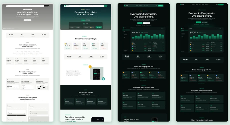
Landing page completeness at different stages, from first wireframe to final dark and light themes.
✦
The final page has 10 sections, and each one answers a single question.
✦Key Sections
Here are a few key parts of the page I designed, and the thinking behind each one.
01 · Making the hero show the product, not describe it
Before
"A smarter way to buy, track and grow crypto"
Broad promise and a lifestyle photo placeholder
After
"Every coin. Every chain. One clear picture."
The job in one line, with a real product shot
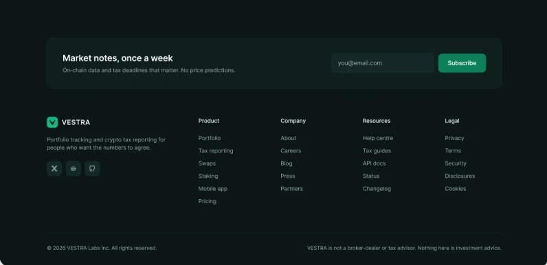
The final hero names the job in one line. Under it sit a free call to action, a "See how it works" option for people still deciding, and three trust signals. Below that, a full portfolio dashboard shows realistic balances, holdings and activity instead of a stock photo.
✦
Above the fold: 2 calls to action, 3 trust signals and 1 product shot.
02 · Making prices feel live instead of listing them
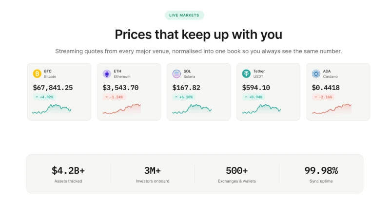
I turned live prices into their own section, built around what a holder checks first when they open the app: where the market is right now. Five cards, one per major asset, each show the current price, the 24-hour change and a small sparkline for the day's movement.
The headline promises prices that keep up with you, and the subline explains how: quotes streamed from every major venue and normalised into one book, so the number on the card matches the number in your portfolio and at checkout.
Below the cards, a stats strip backs up the scale behind it: $4.2B+ in assets tracked, 3M+ investors, 500+ connected exchanges and wallets, and 99.98% sync uptime. If the copy said the data was reliable, the section had to show the proof.
✦
Every claim had to be backed by something visible. If the copy said the numbers agree, the interface next to it had to show those numbers.
03 · Answering the trust question head-on
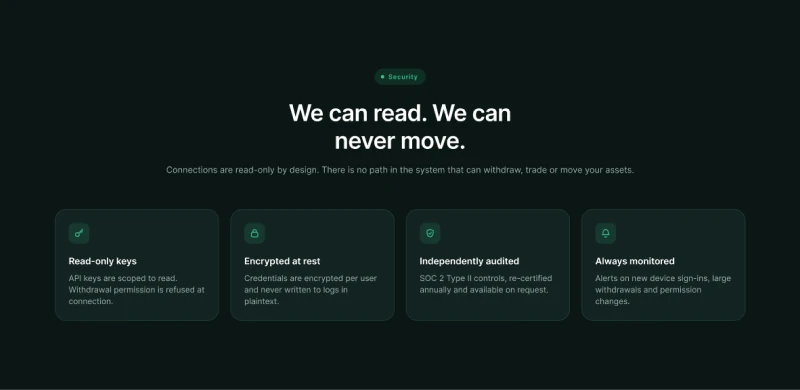
In crypto, the biggest objection is the fear of losing funds. I gave security its own section with a direct headline, "We can read. We can never move.", backed by read-only keys, AES-256 encryption at rest, SOC 2 Type II controls and 24/7 monitoring.
Just above it, three simple steps set expectations:
ConnectLink your exchanges and wallets
ReconcileVestra rebuilds your full history
See it, file itOne clear picture and a tax report
04 · Putting the product in their hand, not just in the copy
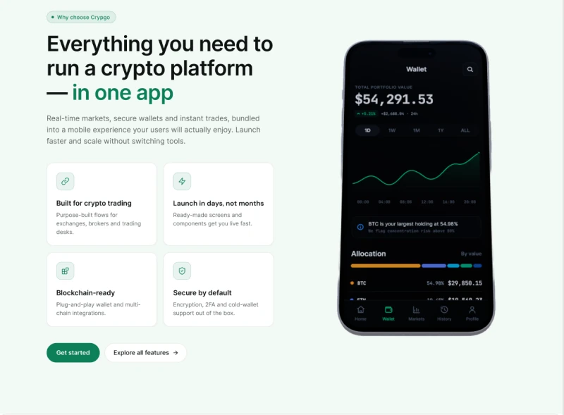
This section is rebuilt around a real screen. On the left, the pitch: everything you need to run a crypto platform in one app, supported by four short cards covering trading flows, launch speed, multi-chain wallets and security. On the right, the wallet view as a user would see it on their phone.
The screen was chosen to prove the copy, not decorate it. It shows a total portfolio value with the 24-hour change, a chart with time ranges from one day to all time, an allocation breakdown by asset, and an insight that flags BTC as the largest holding at 54.98% before it crosses a concentration limit.
The cards say what the product does; the phone shows it already doing it. Two clear actions close the section: get started, or explore every feature in depth.
✦Details
Sweating the details that build confidence
Throughout the page, I kept coming back to one principle from the design system:
The number is the interface.
If people can see it, they're more likely to believe it. Here's how that showed up across the page:
Stats and live prices set in a monospaced face so digits line up
Every price change marked with a sign and a caret, not colour alone
Trust signals placed directly under the main call to action
Pricing stated plainly: free while your portfolio is under $10,000
An FAQ that opens on the hardest question: "Can Vestra move my funds?"
Even the footer keeps the tone: weekly market notes with no price predictions, and a plain statement that nothing on the page is investment advice.
✦Visual Design
Calm, dark and numerically honest
Deep green-black surfaces keep a busy market feeling calm, a single Vestra green carries every action, and gains and losses are always paired with a sign and a caret so colour is never the only signal.
Night#0A1614Dark theme surface
Deep pine#0E2B2EHero gradient
Vestra green#0B8058Primary actions
Mint#10B981Logo and highlights
Get StartedStart Trading$67,841.25▲ +4.82%▼ −1.24%
Colours and components taken from the Vestra designs.
✦Reflections
Show it, don't just say it
Start from the user's questions, not a template
The generic fintech structure looked finished but said nothing. Ordering the page by the questions a careful investor asks gave every section a reason to exist.
Proof beats promises
In a category built on trust, every claim needed something visible beside it: real numbers, a real screen and a security section that answers the hardest question directly.
Thanks for reading!
CW Real Estate · Mobile website
CW Real Estate
2026 Designing a clearer way to find a home in Lagos
Mobile websiteProduct DesignUX/UI
A mobile website for a Lagos brokerage built around neighbourhood specialists, so people can discover, compare and view homes with someone who knows the street.
✦Overview
Client
CW Real Estate, Lagos
Role
Product Designer
Platform
Mobile website
Timeline
2 months · 2026
Type
Client project
Deliverables
25 high-fidelity screens Onboarding and sign-in, search and filters, results, property details, viewings, neighbourhood guides, agent profiles, messaging and calls, and company pages
Overview
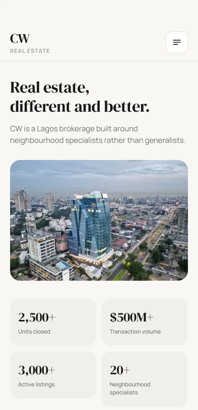
CW began with a simple observation: most Lagos agents sell everywhere and know nowhere. They built the opposite: one specialist per neighbourhood, who lives there, tracks every transaction on the street, and tells you when a property isn't worth it.
The website needed to carry that promise, turning a specialist brokerage into a calm, trustworthy place to find a home.
✦Highlights
25
Screens designed
From onboarding to booking a viewing and talking to a specialist.
8
Neighbourhoods
Ikoyi, VI, Lekki, Oniru, Ikate, Chevron, Osapa and Ajah, each with its own guide.
1
Specialist per area
Every listing leads back to a person who knows the street.
3
Ways to talk
Chat, audio call and video call for virtual viewings.
✦The Challenge
Finding a home in Lagos is built on guesswork
Buyers and renters piece together listings from scattered sources, can't easily tell which homes are genuine or fairly priced, and rarely know who to trust once they find one they like. Agents cover the whole city, so local knowledge gets lost.
Pinpointing the issues
Too much noise from listings spread across the city
Unclear value: is this property worth the price?
No local expert who really knows the street
Hard next steps from liking a home to seeing it
Most Lagos agents sell everywhere and know nowhere. We built the opposite.
✦Research
Understanding how people look for a home in Lagos
CW's whole model rests on local knowledge, so I started with the people it serves: what makes house-hunting in Lagos stressful, where trust breaks down, and what someone needs to feel confident enough to book a viewing.
Who we designed for
HS
The Lagos home seeker
Buying or renting on the island, browsing on their phone between meetings
Goals
Find a home in the right area
Know the price is fair
View it quickly
Frustrations
Listings scattered everywhere
Agents who don't know the area
Endless back-and-forth to arrange a visit
Needs
Search by neighbourhood
Honest local advice
An easy way to talk and book
Where the experience breaks down
Pain point A
Agents who know nowhere
Most agents cover the whole city, so buyers rarely get honest, street-level advice on whether a property is worth it.
Pain point B
No sense of the neighbourhood
Listings show the house but not the area: security, lifestyle, commute and how prices compare.
Pain point C
Too many steps to a viewing
Going from liking a listing to standing inside it means calls, messages and waiting, so good homes get missed.
User journey map
I mapped the journey from first opening the site to booking a viewing, to see where doubt and effort pile up, and where CW's specialists could make the difference.
Scroll sideways to see the full map →
Stages
Discover
Search
Evaluate
Connect
View
Actions
Open the site, read the intro, browse featured homes
Pick a neighbourhood, set type, budget and filters
Compare listings, read details and the area guide
Message, call or video-call the specialist
Choose a day and time, confirm the viewing
Goals
Get a feel for what's available
Narrow down to homes that fit
Decide if a home is worth seeing
Get honest answers fast
See the home with as little hassle as possible
Touchpoints
Onboarding, homepage
Property search, filters, results
Property details, neighbourhood guide
Agent profile, chat, audio and video call
Schedule a viewing, saved properties
Emotions
🙂Hopeful
😐Overloaded
🤨Doubtful
😣Impatient
😊Relieved
Pain points
Generic portals that feel cold and crowded
Too many results that don't match
No way to judge the area or the price
Slow replies from agents who don't know the street
Arranging a visit takes days of calls
Opportunities
A warm, editorial welcome and featured homes
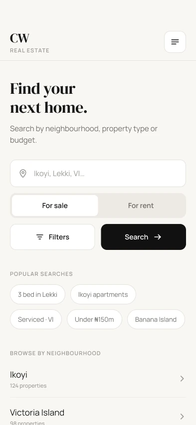
Search by neighbourhood, popular searches and a live result count
Neighbourhood guides with average prices and why people live there
One named specialist per area, with chat and calls built in
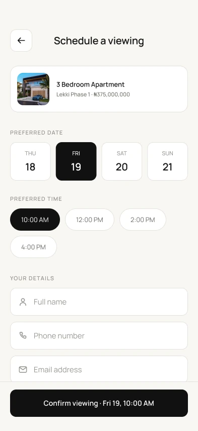
Book a viewing in one screen
✦Ideation
With the journey mapped, I turned each opportunity into a question for the design, then mapped the flows and structure before designing the screens.
01
How might we…
HMW
…let people search the way Lagosians think, by neighbourhood?
HMW
…help someone judge an area before they ever visit?
HMW
…put a real local expert one tap away from every listing?
HMW
…turn "I like this home" into a booked viewing in minutes?
02
User flows
I mapped the core flows end to end to define the scope and keep every path to a viewing as short as possible.
Get started
Onboarding ×3→New or returning?→Sign up / Sign in→Homepage
Find a home
Search→Filters→Results→Property details→Schedule a viewing
The menu mirrors how CW works: homes, the neighbourhoods they sit in, and the people who know them.
Properties
Search
Filters
Results
Details
Saved
Neighbourhoods
All areas
Area guides
Featured homes
Agents
Specialists
Profiles
Reviews
Messages
Chats
Audio call
Video call
Company
About CW
Services
Contact
✦The Solution
Design the whole journey around the neighbourhood and the specialist
Instead of a generic listings site, every part of the experience points back to a neighbourhood and the person who knows it best.
01
Search by neighbourhood
Start from where you want to live, with popular searches and every area one tap away.
02
Decide with confidence
Clear prices, key facts and neighbourhood guides help people judge a home before they visit.
03
Talk to the specialist
Message, call or video-call the local expert, then book a viewing in a few taps.
✦Key Features
01
A warm first impression
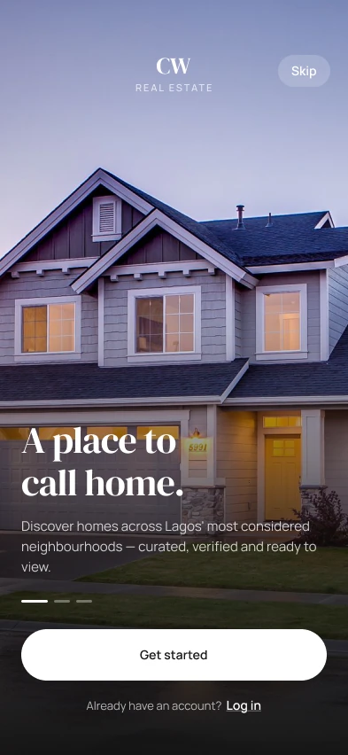
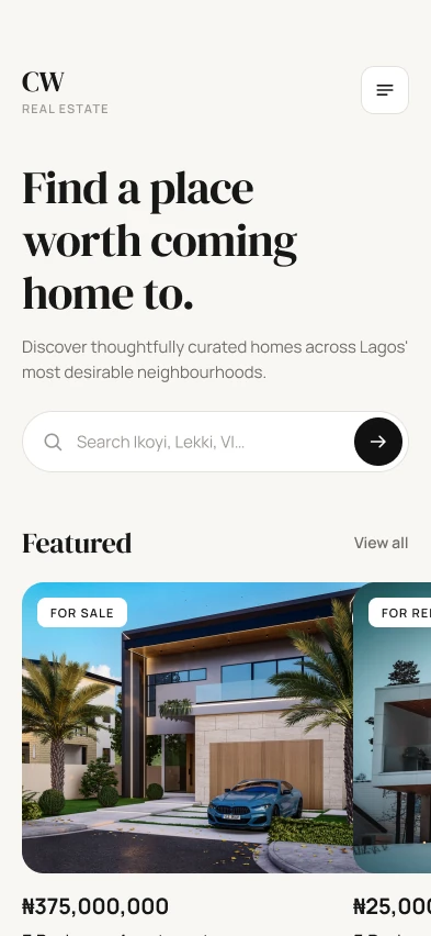
Onboarding opens on a real home and a simple promise: "A place to call home." The homepage gets straight to work with "Find a place worth coming home to.", a neighbourhood search and featured listings.
02
Search that starts from the neighbourhood
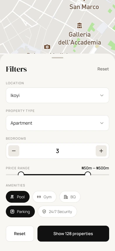
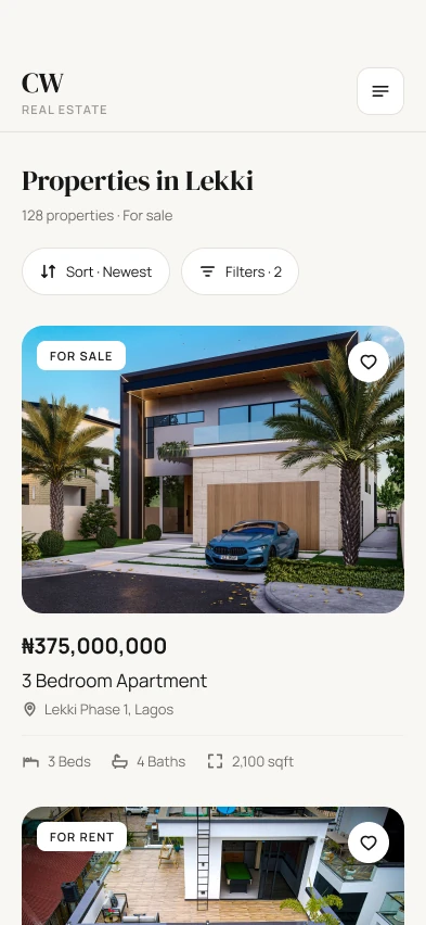
People search by area, property type or budget, switch between sale and rent, and pick from popular searches like "3 bed in Lekki". Filters live in a bottom sheet with location, type, bedrooms, a price range and amenities, and the button tells you exactly how many properties match.
03
Details that help people decide
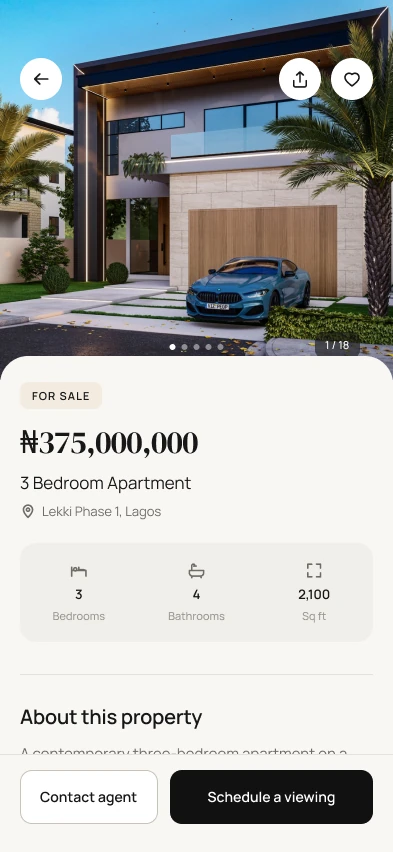
Each property leads with large photos, the price in naira, its location and key facts at a glance, with "Contact agent" and "Schedule a viewing" always at the bottom of the screen. Booking takes one screen: pick a day, a time and add your details.
04
Neighbourhood guides and specialists
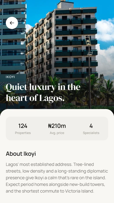
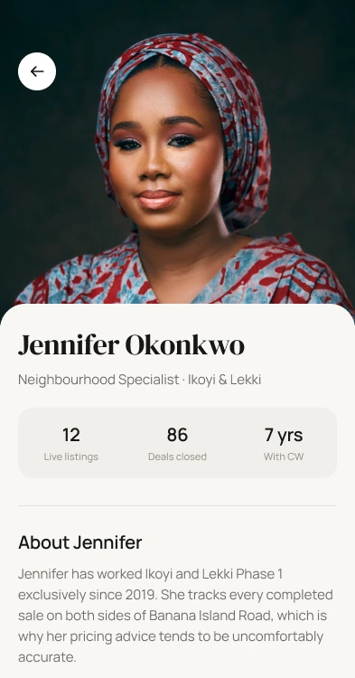
Every area has its own guide, like Ikoyi's "Quiet luxury in the heart of Lagos.", with properties, average price, specialists and why people live there. Specialist profiles show live listings, deals closed and years with CW, so you know who you're dealing with.
05
Talk to someone who knows the street
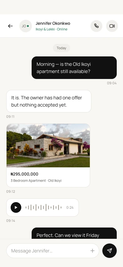
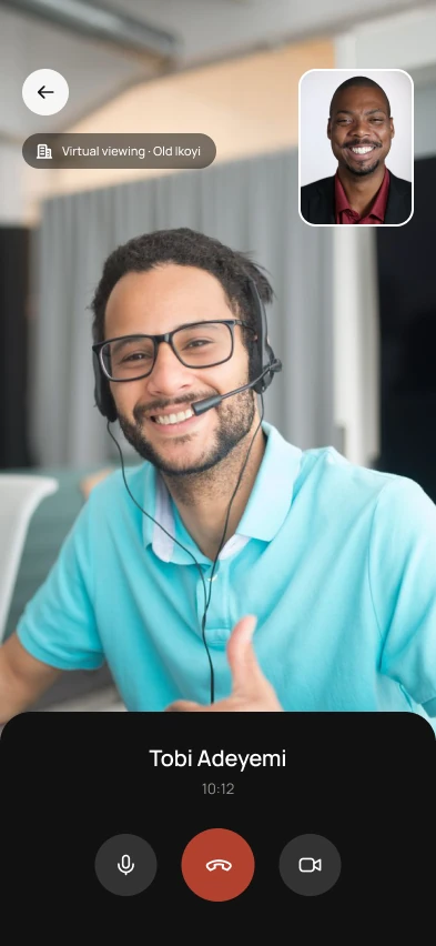
Messaging feels familiar, with shared listings and voice notes inside the chat. Audio and video calls make virtual viewings possible, so a buyer can walk through a home without crossing the city.
✦Visual Design
Editorial, warm and quietly premium
A serif display face gives CW the feel of a considered brand rather than a listings portal, paired with a clean sans for everything practical. Warm off-white surfaces, near-black actions and generous photography let the homes do the talking.
AaDM Serif DisplayHeadlines and the CW wordmark
AaManropeBody, labels and buttons
Ink#171717Text and primary actions
Linen#F6F4EFPage background
Stone#EDEBE5Cards and toggles
Taupe#9A9791Muted labels
Schedule a viewingContact agentFor sale3 bed in LekkiPool
Typography and colours taken from the CW Real Estate designs.
Designing the in-between moments
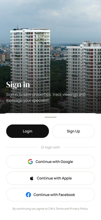
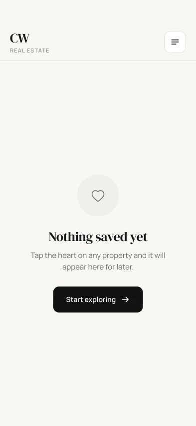
Sign-in explains why it's worth it: save properties, track viewings and message your specialist. Even an empty saved list points somewhere useful, with a single "Start exploring" button.
✦Reflections
The brand promise is the product
Put a person behind every listing
CW's difference is its specialists, so they show up everywhere: on neighbourhood guides, profiles, chats and calls. Trust comes from knowing who you're talking to.
Every screen should lead to a next step
From an empty saved list to a property page, each screen ends in a clear action, which keeps people moving from browsing to booking a viewing.

 TegaPay